This dropped theough my letterbox today and I’m very excited to finally be able to read it
Wrangling the ones and zeros. Dreaming of the mountains.
This dropped theough my letterbox today and I’m very excited to finally be able to read it
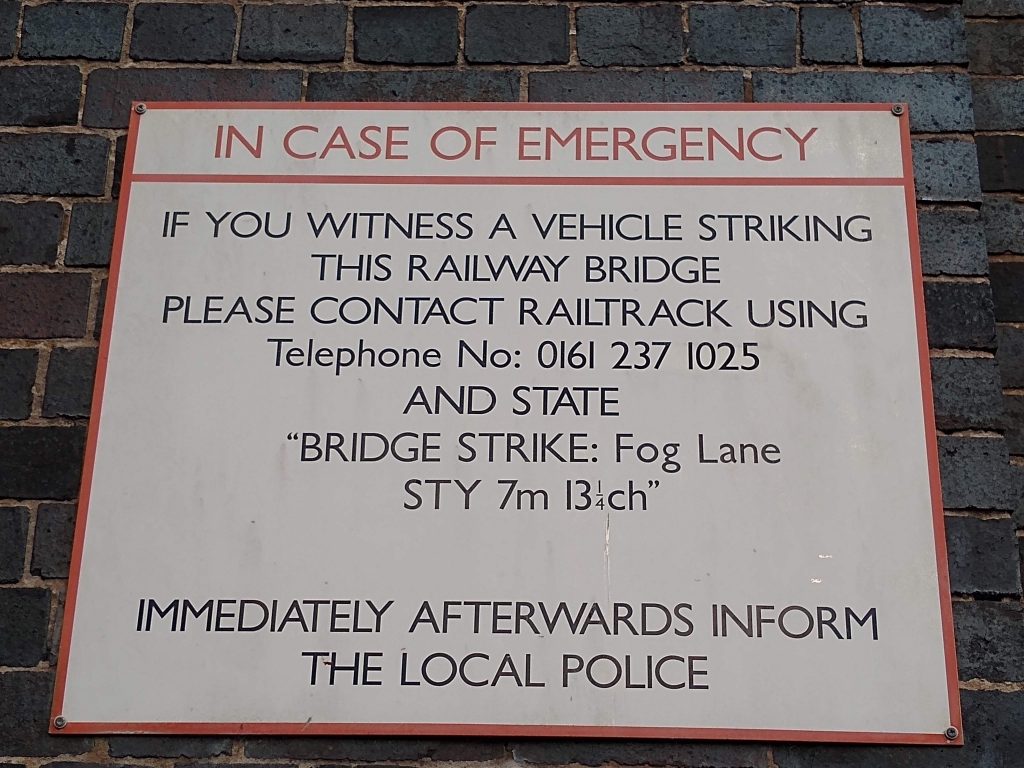
I pass this sign every day when I return home from work, and its always irritated me. It sign reads:
IF YOU WITNESS A VEHICLE STRIKING
THIS RAILWAY BRIDGE
PLEASE CONTACT RAILTRACK USING
Telephone No: 0161 237 1025
AND STATE
“BRIDGE STRIKE: Fog Lane
STY 7m13¼ch”
Who thought that “7m13¼ch” made a good identifier? And especially one that had to be read and recited over a phone in a hurry. Why not a simple composite numeric key?
And why is one line of text in title case and all the rest in upper case? Grr…
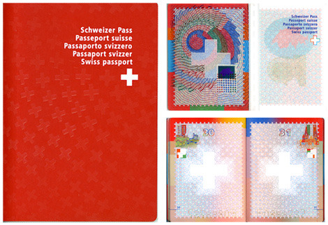
Swiss passport design. Clean and effective.
Figure/ground reversal