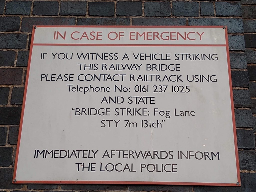
I pass this sign every day when I return home from work, and its always irritated me. It sign reads:
IF YOU WITNESS A VEHICLE STRIKING
THIS RAILWAY BRIDGE
PLEASE CONTACT RAILTRACK USING
Telephone No: 0161 237 1025
AND STATE
“BRIDGE STRIKE: Fog Lane
STY 7m13¼ch”
Who thought that “7m13¼ch” made a good identifier? And especially one that had to be read and recited over a phone in a hurry. Why not a simple composite numeric key?
And why is one line of text in title case and all the rest in upper case? Grr…